Navigation, Page Layouts & Common Icons #
Navigation to pages #

Much of the navigation in Astria will be through the top ribbon, which displays the available pages.
Astria only has a single ribbon with a range of drop down subpages for grouped areas. e.g. all the Users pages are under the Users button in the top ribbon.
Astria also has right click navigation events within pages and hyperlinks links to other pages with specific information.

User and Item Memory #
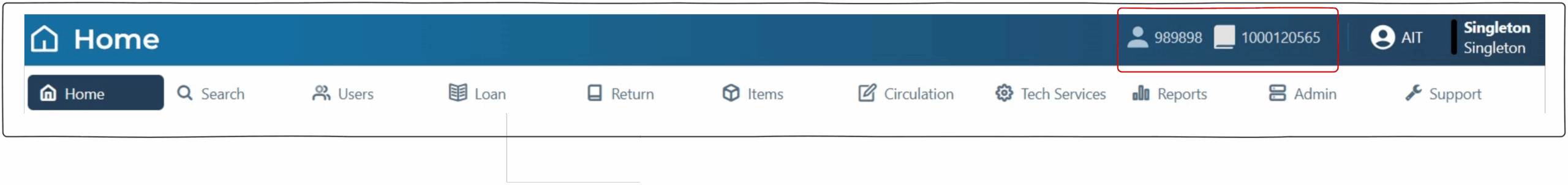
Astria holds the current User and current Item in memory, this enables operator to navigate through multiple screens regarding the same user or item. These are displayed in the top right of the screen. Click on the User ID or Item to remove from memory.
Operator Identification, Logout and Location buttons #
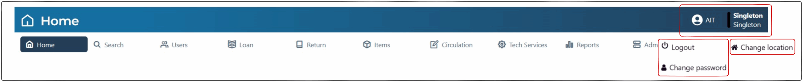
The operator identification is displayed at the top right of the screen. Clicking on the operator name will present a dropdown to logout or to change password.
The location is displayed at the top right of the screen. Clicking on the location will present a dropdown to change the logical and physical location available to the operator.
Results Grid #
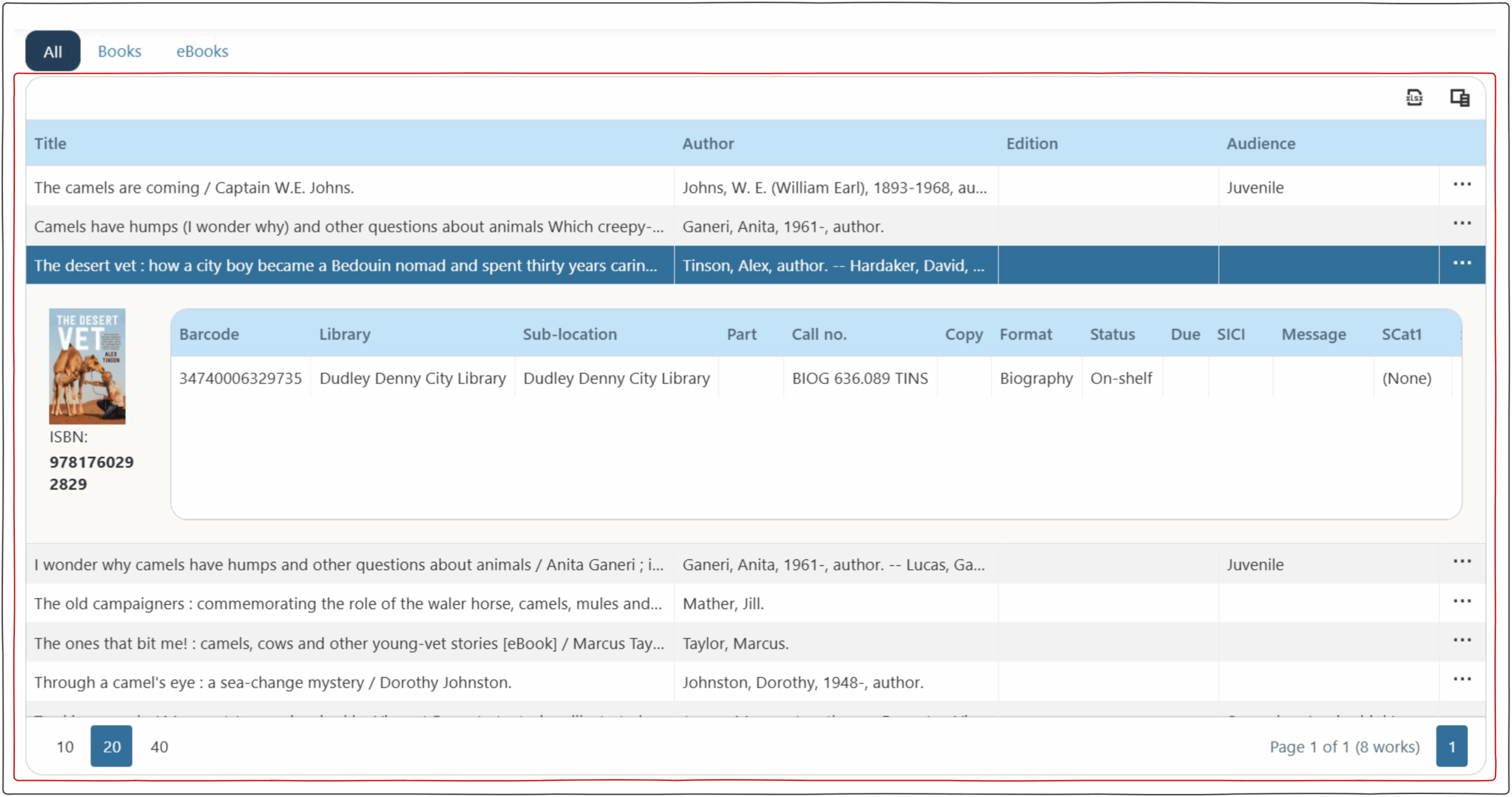
Through out the documentation a results grid will be referenced. Most pages have a results grid which displays information. These grids have common display elements including sorting and action buttons.
Sorting of the Grid Results #
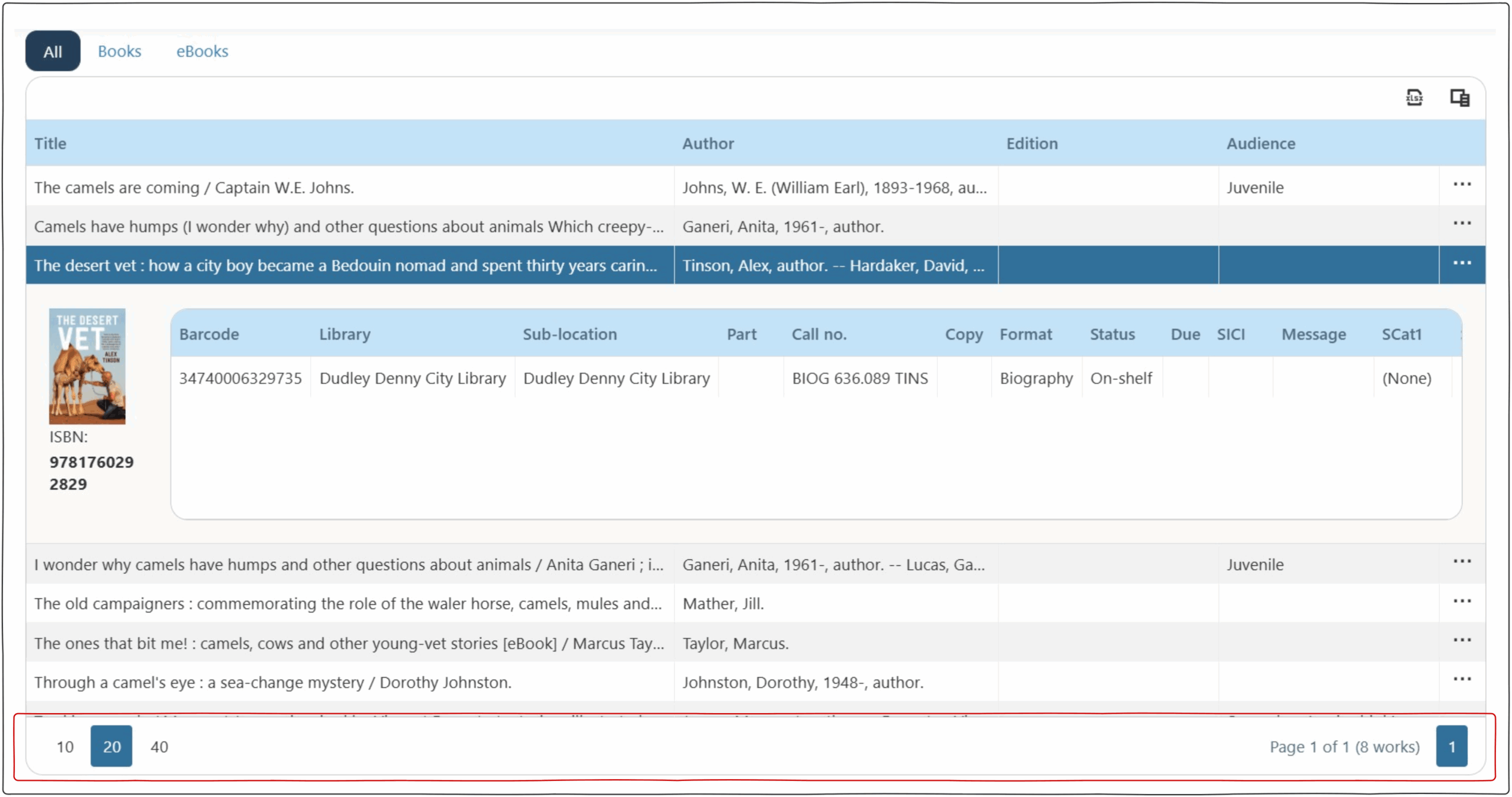
Most grids have a sorting and display filter at the bottom of the page.
On the left an operator can set the number of results displayed on the page e.g. 10, 20, 40 rows.
On the right there is information on the number of results with the page being displayed. Clicking on different pages (if multiple pages of results exist) displays more pages of results in the grid.
Grid Action Buttons #
The column chooser action button enables operators to select what columns are displayed in the grid.
The export action button enables operators to export data to Excel.
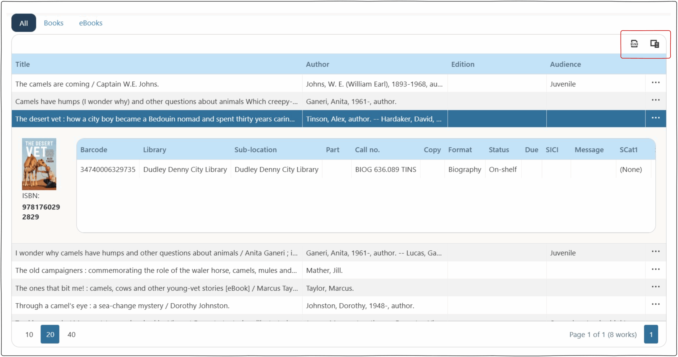
Search Sub-Grid #
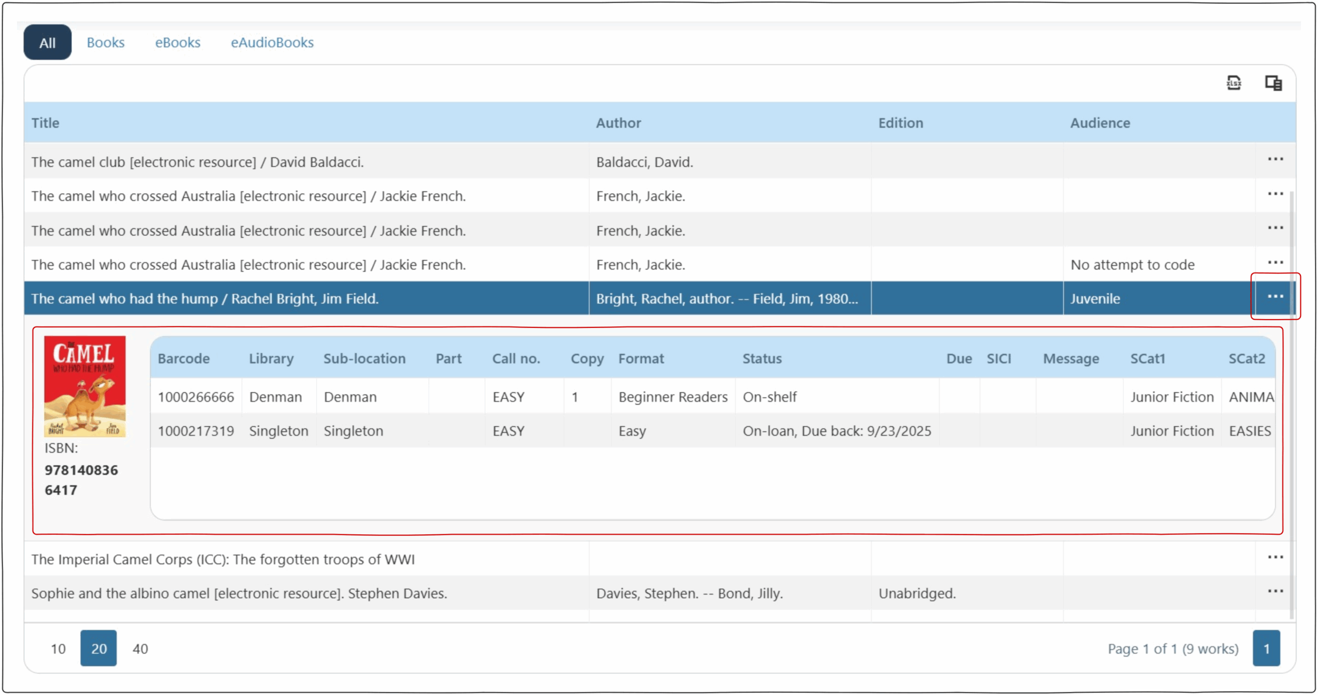
The Search screen has an accordion sub grid that display the items associated with a selected work. Clicking on the three dots to the right of the work, will display more information including notes.
Common Icons #
 | EDIT | This icon is used to enable editing information from the grid. |
 | DELETE | This icon is used to delete selected information. |
 | EXPORT | This icon is used to export information from the grid that is below the icon, it often has 2 options ‘Export all data’ and ‘export selected rows’ allowing you export all information including across multiple pages or specific rows. The exports are saved to the folder specified in the Browsers default download locations (Most often the “Downloads folder”). |
 | EXPORT PDF | This icon is used to export information from the grid as a pdf. The exports are saved to the folder specified in the Browsers default download locations (Most often the “Downloads folder”). |
 | MORE INFO | The three dots ‘more information’ icon is used across most pages. If the view is too small to display all columns this information is wrapped into the ‘more information’ drop down. |
 | USER CONTENT BELL | This bell icon is present in many of the user screens. Clicking on the bell displays a drop down of all the user pages that have content in them. |
  | COLUMN CHOOSER | This icon is on many page above the results grid. Clicking it will provide a list of the columns present in the grid. Using the checkbox, operators are able to hide/show a range of columns. |